Our newest client is a North American AI infrastructure startup. It runs two businesses under one brand. The first is dedicated GPU compute: reserved GPU pods in containerized modular data centers, rack colocation and standardized hardware delivery. The second is a unified AI inference platform: a single OpenAI-compatible API that gives developers serverless access to leading open and frontier models such as DeepSeek, Qwen, GPT-4o and Claude, with intelligent routing between them and flexible, usage-based pricing.
The client asked us not to name them publicly yet, so this write-up covers the design thinking without identifying details. We describe only what is live on the site. We have no traffic or revenue numbers to report, and we will not invent any.
The Challenge: Selling Things Nobody Can See
A restaurant site can show the food. An AI infrastructure site sells latency, routing logic, spare GPU capacity and security guarantees, and none of those can be photographed. The buyers are also mixed:
- Developers want to know how hard integration is and which models they can call.
- Finance and operations leads care about cost per GPU-hour, cost per million tokens and how to stop departments from overspending.
- Security and compliance officers, especially at financial firms, want to know where prompts go and who can read them.
Our job was to give each group its own path through one page without turning it into a wall of jargon.
The Entry Portal: Walking Through the Gateway
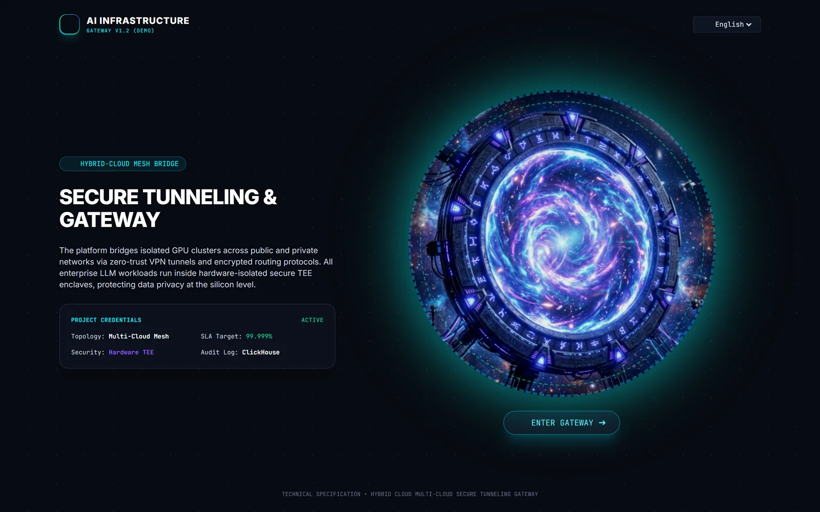
Before any product copy, visitors land on a single full-screen scene: a glowing gateway, one line of positioning and one button, "Enter Gateway". Clicking it floods the screen with light, and the product homepage fades in on the other side. The portal is the brand metaphor made literal. The company sells a gateway to AI compute, so the first thing a visitor does is walk through one.
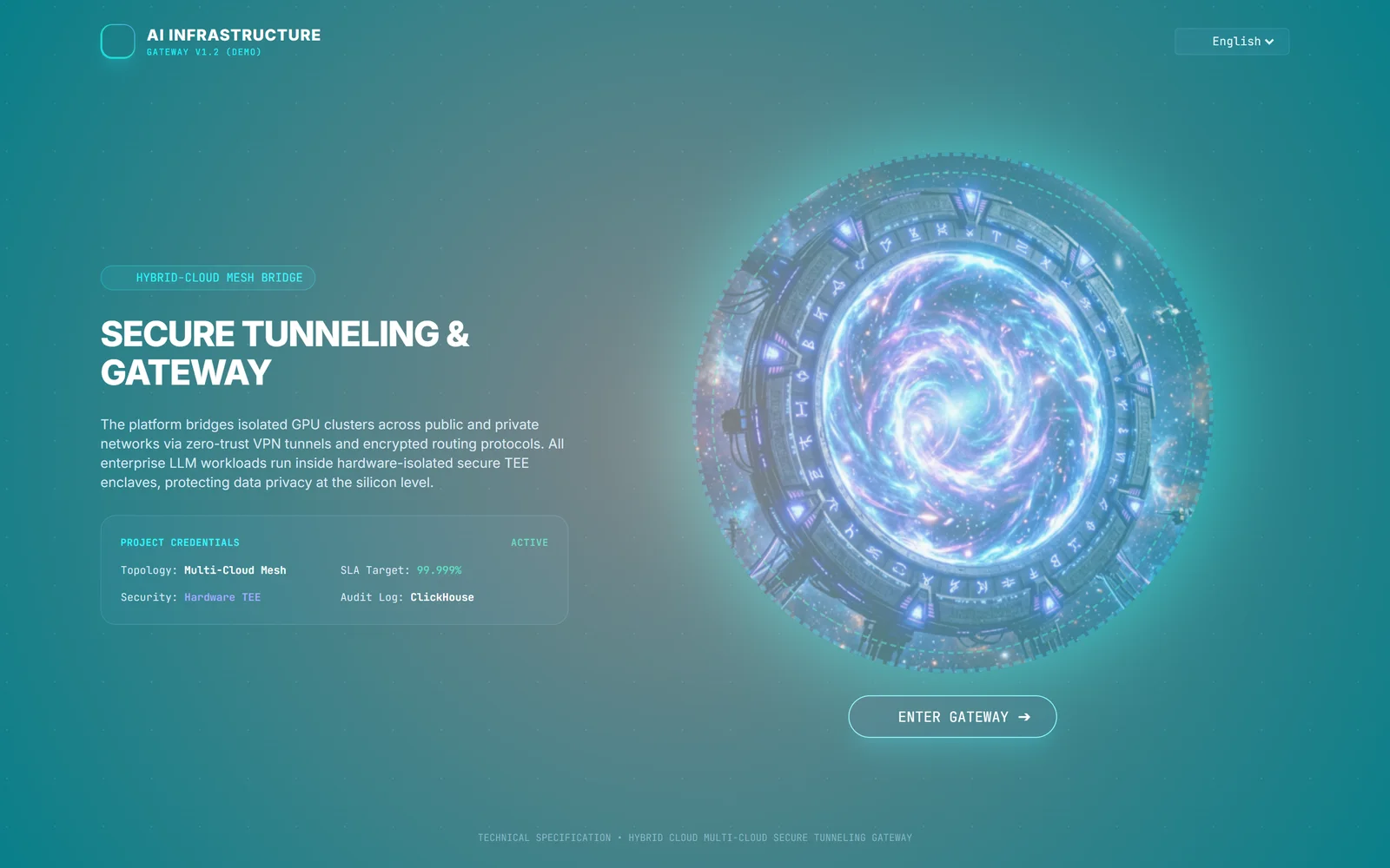
This threshold logic is a signature of how Apexzone7 designs for technology brands. We look for the one idea that sums up the company and turn it into the first interaction, so the story is told before a single feature is listed. The entry costs one click, keeps the homepage itself fast and clean, and gives visitors a moment they remember and talk about.
Design Decision 1: Two Products, One Clear Headline
The hero section states both businesses in a single line (a unified inference platform plus dedicated GPU infrastructure) and backs it with three short proof chips: a live latency reading measured from the visitor's own browser, "1-line base_url integration", and the hardware-security approach. Two calls to action split the audiences: one leads to the compute and inference offerings, and the other leads to API key signup, labeled "Coming Soon" because the billing portal is not open yet.
Design Decision 2: Make Abstract Services Interactive
Instead of describing routing in prose, the hero includes an interactive routing arbitrator. The visitor picks an enterprise workload, such as a risk simulation, a 10-K filing review, a support ticket or a code refactor, and moves two sliders for latency priority and cost priority. The panel then shows which model and which compute location a gateway would pick. Further down the page, the same idea carries through several sections:
- A GPU spot marketplace table comparing H100, H200, B200, L40S and A100 options by region, with a filter by GPU family.
- A hosted open-weights model catalog (DeepSeek, Llama, Qwen) presented as deployable cards.
- A smart router configurator showing presets (lowest latency, cost saver, strict on-prem), a fallback chain across providers and a semantic-cache threshold.
- A multi-model playground that sends one prompt to four model clusters side by side.
Design Decision 3: Label Every Demo Honestly
This was the most important call on the project. Most of the interactive panels run on sample data, and the site says so on every one of them: "Simulated demo data", "Simulated router engine", "Simulated FinOps governance". Features still in development carry "Coming Soon", and compliance items carry their real status, such as Planned, In Progress or Demo Ready, never a blanket "certified".
Infrastructure buyers do technical due diligence. If they later find a benchmark that was really sample data, or a certification that does not exist yet, they stop trusting everything else on the page. Clear labels let the demos explain the product without making claims the company cannot yet back up. The same rule applies to AI assistants: when ChatGPT or Perplexity summarizes a vendor, the model repeats what the page says, so the page should say only true things.
Design Decision 4: Developer Proof, Not Developer Promises
For an inference platform, the strongest selling point is how little code a developer has to change. The documentation section shows working drop-in examples in Python, TypeScript and cURL. Each one uses the standard OpenAI SDK with only the base_url and API key changed, plus an optional header for department-level quota tracking. A developer can judge the integration effort in ten seconds without reading a pitch.
Design Decision 5: Governance and Security for Regulated Buyers
Because the target market includes North American financial firms, two sections speak to them directly:
- Cost governance: department budget caps, token quotas and rate limits, plus a capacity view across the private GPU cluster and public-cloud pools. This covers both token spend and leased compute spend.
- Security architecture: an inline PII-masking demo that shows sensitive financial fields redacted before a prompt leaves, a hardware TEE attestation demo, an immutable audit-log view, and a compliance roadmap with an honest status on each item.
Design Decision 6: Founder Credibility as a Timeline
Many AI startups are only a year or two old. This founder brings decades of hands-on experience in enterprise networking, IT infrastructure and security. We presented that background as a short timeline that leads to the current product. It answers the question "why should we trust a new AI vendor?" without adding any claims beyond the founder's own experience.
Visual and Technical Choices
- Dark, data-console aesthetic: a near-black background, monospace figures and status badges, so the site looks like the operations tools the audience already uses.
- Clear navigation by audience: Overview, Compute Marketplace, Smart Router, Security & TEE and About.
- Search and AI discoverability basics: a descriptive meta description that names both services,
SoftwareApplicationstructured data, and a sitemap and robots file, so search engines and AI crawlers can classify the company correctly from day one.
Takeaways for AI and Tech Companies
- Show, don't describe. Interactive panels explain routing, GPU pricing and governance better than paragraphs do.
- Label demos and roadmap items. Honest status labels protect trust during due diligence and keep AI summaries of your company accurate.
- Put the code on the page. For API products, a three-line integration example is the best conversion copy you have.
- Give each buyer a path. Developers, finance and compliance read the same page for different reasons, so design a section for each.
Project summary: see this project in our portfolio.
If you run an AI, SaaS or infrastructure company and your website doesn't yet explain what you actually sell, talk to us. We design and build bilingual, search- and AI-ready sites for technical companies in New York.